Marketplace
A Procurement
E-commerce platform
Product purpose
Background: HealthTrust is an umbrella corporation, including the CoreTrust and AdvantageTrust subsidiaries. Marketplace started off as a CoreTrust product, in the commercial, non-healthcare space, later moving into acute care.
Problem: The CoreTrust membership didn't often purchase deeply discounted items through the correct channel, leaving their free membership perks unrealized. However, this also meant CoreTrust missed out on capturing their part of sales.
Business Goal: Increase sale dollars and expand the membership funnel.
Product Goal: Save time for the CoreTrust membership by quickly identifying the correct channel and item to purchase (with heavily negotiated prices) in a one-stop shop, instead of buying from competitor websites.
Where I started
I leveraged user-testing on an existing product that struggled to launch successfully. This helped us get buy-in from senior leadership to scale the product.
Areas we needed to enhance
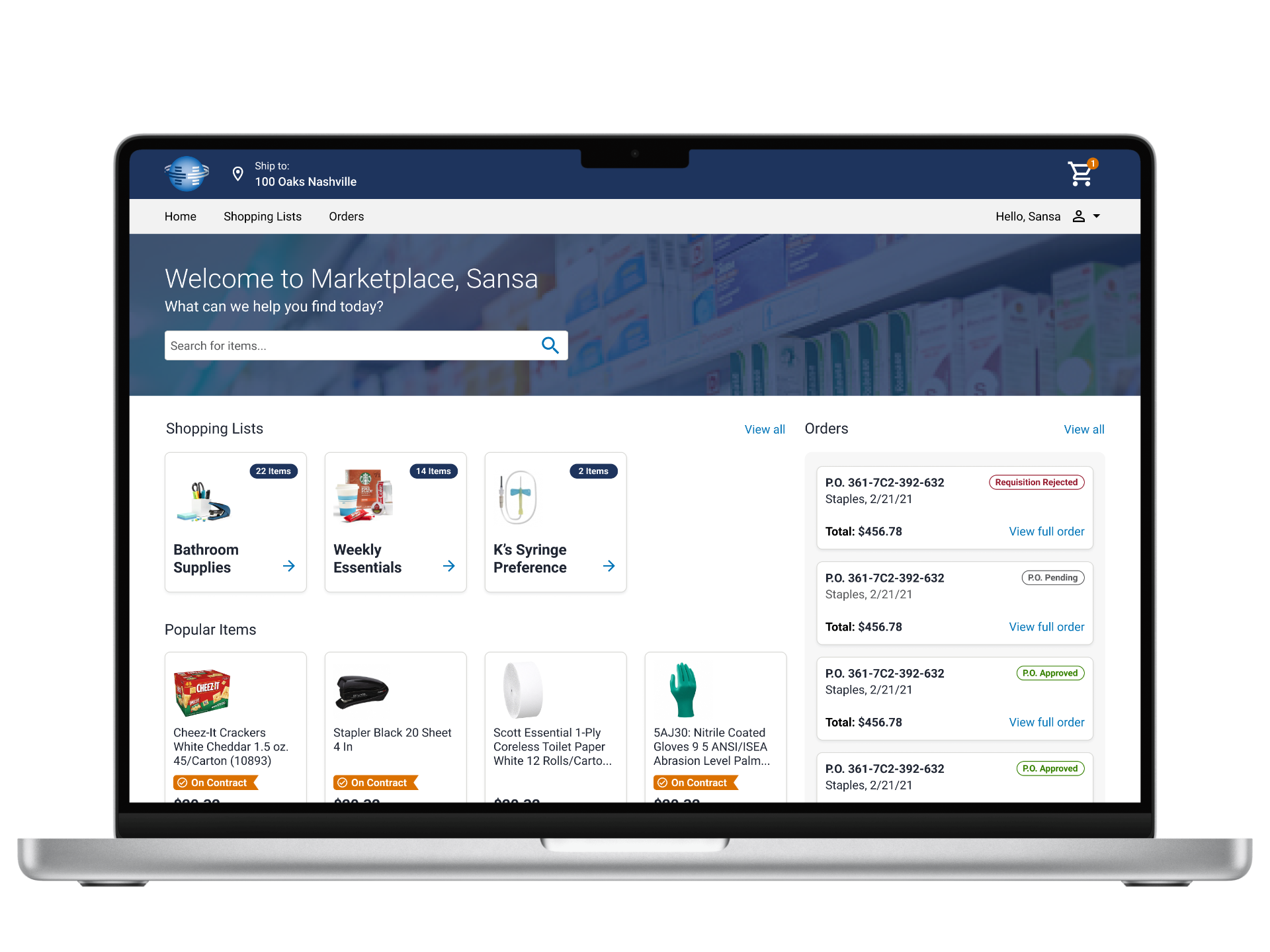
Search experience
Identification of "On Contract" items, or best-priced through CoreTrust
Alternative items display
Product home page providing immediate value
Usability testing: search experience
Problem
The searched items didn't appear at the top of the results, causing customers to buy elsewhere.
What we wanted to learn
What keywords and phrases does our audience use to search for these items?
Can they find the item they’re looking for?
How far will they search for an item before giving up?
What we did
Ran a 10 question usability test with 5 participants in our live product
Test results - round 1
KPI 1: Relevant items shown in search results 80% of the time
KPI 2: 100% of Successful Searches take 1 Search and 2 Clicks
Our findings:
Our test had an 80% successful search rate, but we needed closer to 100% to launch.
Product Images were either too small or didn't exist, leaving customers unsure about the product specifics.
Some supplier items had heavier weight in the system, so "Fork Lifts" appeared before "Fork" when a user needed a food utensil.
Most people wouldn't search past page two; they would search again if they couldn't find what they wanted.
No clear indication which items were a part of the contract, aka the correct items with the best price.
Feedback informed changes
Added an “On Contract" Badge to the appropriate items.
Added an "On Contract" section to the filter.
Limited the amount of search results to three pages to prevent user overwhelm.
Added product photos (or enlarged them) by obtaining an updated catalog from suppliers with more images.
Lessened the search weight of items without images, since customers didn't select items without photos.
Gathered a list of SEO synonyms, like "stickies" vs "Post-It™" to improve relevancy in search.
Test Results - Round 2
KPI 1: Relevant items shown in search results 80% of the time.
KPI 2: 100% of Successful Searches take 1 Search and 2 Clicks.
End Result: We improved results from 80% successful searches to 95% successful searches, which enabled us to launch.
Usability testing: alternative items
Problem
The Marketplace application shows multiple supplier items in the search results. If an item isn’t available, or isn’t on contract, can the member find the same or comparable item at the price they need so they don't bounce from the website?
What we wanted to learn
What do members deem a “comparable” result?
Do members understand which supplier item and price they're viewing?
How and where do members interact with alternative items?
What we did
Ran a 10 question usability test with 7 buyer participants in our live product
Test results - round 1
KPI 1: 100% of searches yielded relevant results where a user clicks through to an item.
KPI 2: 100% of alternative items shown, present at least 1 item matching “type”, quantity, and had a lower price.
Our findings:
It was difficult to identify which supplier you were viewing and which unit type was assigned on both the main search and item details pages.
Difficult to identify which items were "On Contract" items.
Members were specific about what constituted as an "alternative item," like "Vanilla creamer 16oz" versus "creamer 16oz."
Members needed a breakdown of cost, based on unit, and wanted to quickly identify the best option, when using the "similar items" section.
Feedback informed changes
Inspired by Amazon, we highlighted the unit type selected for the item, plus identified the suppliers and if the items were on contract.
End Result: With the test results from both studies, we achieved buy-in from our business stakeholders to continue learning in a Pilot environment—a huge win for the team.
I continued to work hand-in-hand with my Product partner to get the Pilot set up with continuous feedback and analytics.
Additionally, I conducted many short interview sessions during sales pitches to help us build out user archetypes, which the team later leveraged.
I'd love to share more of the story with you!
Similar Item section redesign: Identified the price, in a grid. Added on badges for the current item to compare to others. Added the item in the list with the lowest price.