CancerIQ
A Preventive Care
SaaS Product Redesign
Product purpose
Background: CancerIQ, a start-up company, focuses on early detection of cancer. They originally launched the self-titled product in hospital-based genetics clinics, starting with a patient survey and two Software as a Service (SaaS) products, “Navigator” and “Specialist."
Problems: Since they built the existing product for a specific audience, this didn't allow for easy expansion into new verticals, like preventative care. Ultimately, the product acquired a significant amount of technical debt, through one-off enhancements, which created both a broken user experience and interface.
Business Goal: Acquire more customers and increase annual contracts in the preventive care space.
Product Goals:
Merge both existing products into one with a single sign-in experience, including a dynamic interface based on user permissions for a broad array of personas.
Identify preventive care personas and needs to create an aligned experience for providers' and hospital staff's existing processes.
Where I started
I assessed each of the four live products through a heuristics review: Navigator, Specialist, Ithaca, and the CancerIQ Patient Survey.
Genetic counselors, specialists, and their staff actively used Navigator and Specialist, so I started there. After that, I reviewed “Ithaca,” or the name of CancerIQ 1.0 and CancerIQ 2.0 in this case study.
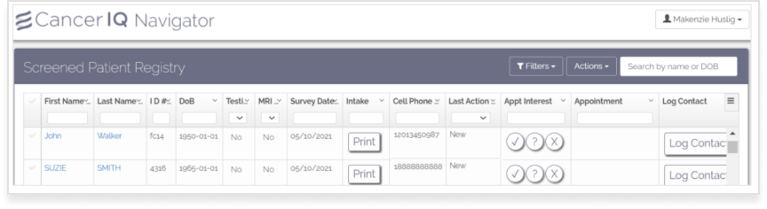
Image: Navigator Experience
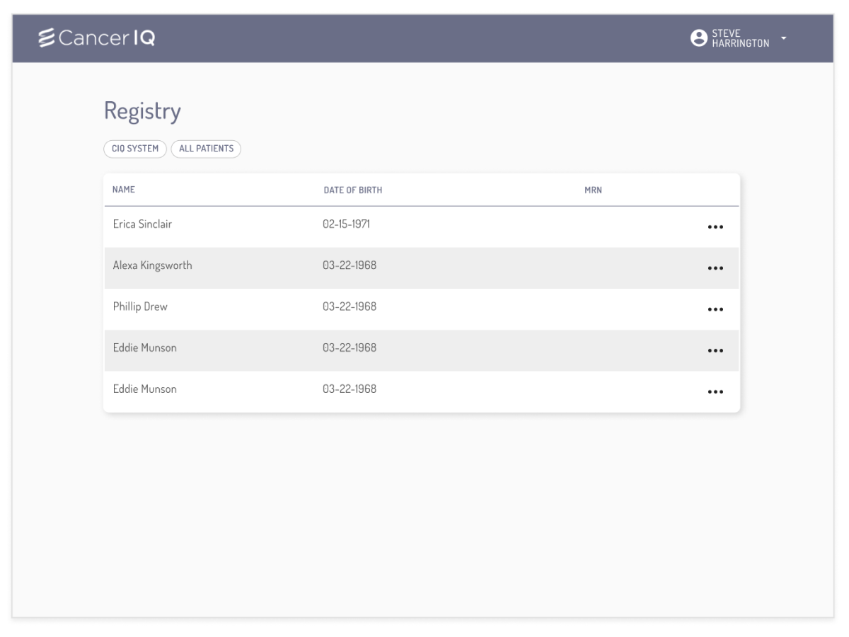
Image: CancerIQ 1.0 Queue View
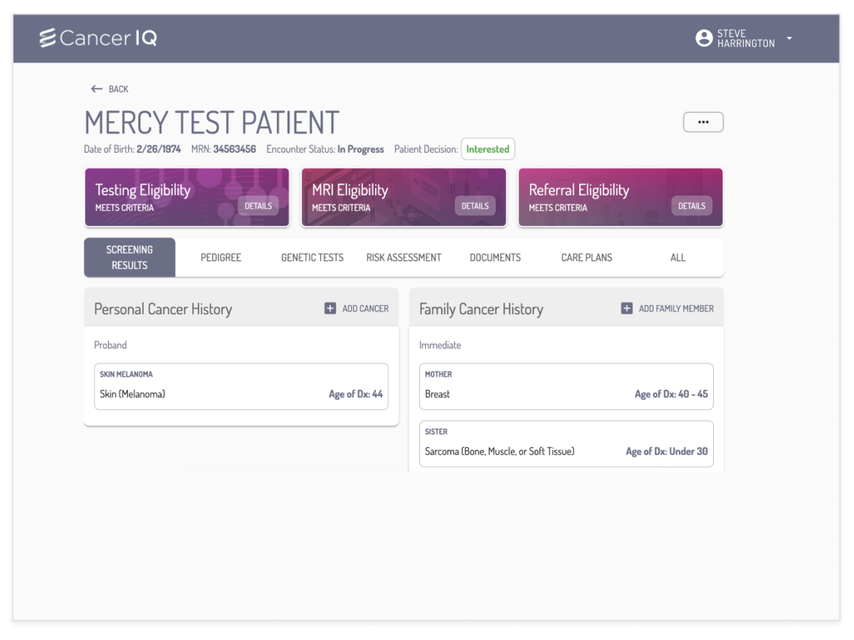
Image: CancerIQ 1.0 Patient View
A Quick Heuristics Review of Navigator
I noted
a minuscule click-area for selecting and opening patient information.
a plethora of buttons with different functions, like opening a modal or acting as a toggle.
in-table search didn’t work for every field or was character specific, like DoB, leaving users with either incorrect data or no data at all.
A Quick Heuristics Review of CancerIQ 1.0
I noted:
a minimal Registry dashboard that missed the majority of available information from the Navigator and Specialist Dashboards.
the buttons below the "Registry" term were filters that didn't follow UX best practices.
the MRN column on the dashboard never populated.
the top-three pinkish hued boxes on the patient landing page relied on a color change from gray to pink to signify a high-risk patient.
the green "Interested" button, used for changing selection, is missing a drop-down icon.
the three-dot menu in the upper-right corner hides important functionality with no title, leaving the user unaware of features.
What I did
Ramp Up
I reviewed the vision designs the CEO mocked up, then assessed which parts I could leverage into the existing framework.
I met with the Customer Success team to learn more about customer processes, existing feedback, and new asks from customers.
Get feedback on wireframes
I created rough UI mock-ups based on:
the requirements I put together with my product VP.
glaring gaps identified by both our Customer Success and Sales teams.
Apply feedback to designs
Through these conversations, I gathered the necessary feedback to update the designs, and through those designs, obtain access to customers to continue discovery research in the space.
Making immediate improvements
In the UIs on the right, you can see this page went through several iterations, based on user and engineering feedback. The changes I outline are their original intent, but many don't stay as we get to the final version (which I'm happy to discuss why, live).
Expanded Filtering - The live site lacked appropriate filtering, so many customers didn't want to use the dashboard since what they needed was hard to find or required too many clicks.
Status Badge - People often mentioned in studies that they found it difficult to identify who was most recent to the queue. CIQ did send the most recent patient to the top, but only on a page refresh. Our addition of a badge and auto-update queue addressed that concern.
Eligibility - Navigator and Specialist focused on genetics in women's health, dedicating a column to each eligibility option. Preventative care expanded to nine options, creating a necessity for faster identification of eligibility.
Care Plans - Adding a care plan grants an additional status of active patient monitoring/managing to the care team.
Personalization - To help providers who work across multiple locations have clarity into the dashboard queue they viewed, the welcome identifies the location that the user signs in from, plus adds personality to the CancerIQ Product.
Easy access Intake form - The people who actively use the product need to easily print an updated intake form, especially in the preventative care space. The live UI includes this, but it’s hidden behind four clicks in the workflow on the patient profile.
Greater side menu functionality - From research, we learned log contact is important for specific users, and they wouldn't switch to the new product without it. To accommodate this, we opted to give a quick link that opened the existing log contact screen in a new window.
Version 1
Version 2
Version 3
Challenges I faced
Engineering technical debt
Limiting the ability to leverage continuous scroll vs pagination
Removing personalization because of a user permission update delay.
Lack of design system from pre-existing designs in not just Figma, but code.
Other significant challenges:
Multiple user personas with individual needs
Limited screen space available for the table
Sales teams leveraging these designs in conversations without knowing when the product would go live or if it would look the same
Time to pivot
At this juncture, I knew my designer, myself, and my Engineering team needed to solidify a new design system quickly, as we continued to design and hand things over.
Leadership allotted us seven days to pause work, so my designer and I created and executed a new design system and Figma component library.
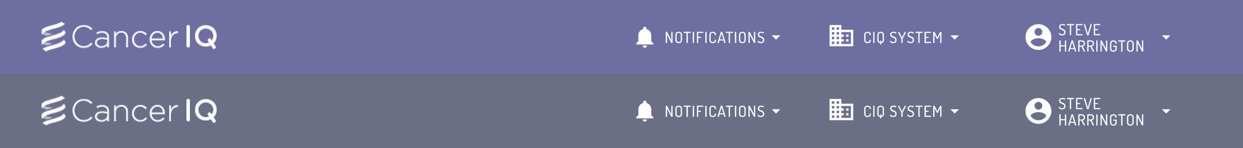
We updated the brand color to replace the gray and drab purple from the brand, and the 8+ hex codes in the system. Choosing a new, brighter, and accessible purple color, we brought life to the product and gave it more customer-grade appeal.
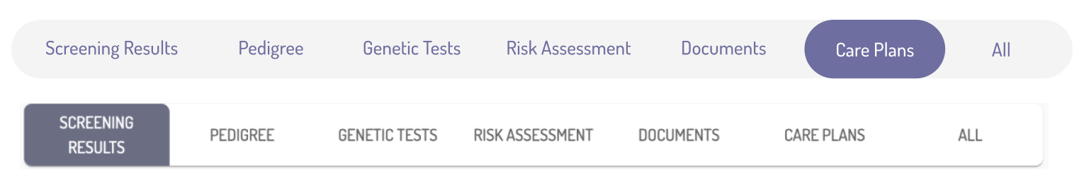
We updated the existing button tabs to a pill-shaped tab group, offering a sleeker feel from the previous component.
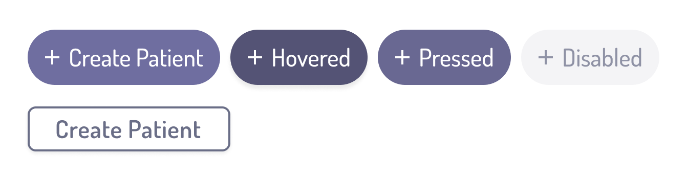
We updated the previous buttons to pill-shaped buttons, updated colors, and created an entire set of buttons with various states (something our engineers were thankful for!). We also built everything in auto-layout, ensuring future designs had the flexibility we needed.
Product enhancements
With a new design system and component library in place, we addressed some of the challenges I faced in previous designs.
Full Width: I’d gotten screen size data from our Engineering team and we decided to expand our screen width moving forward, giving us more space in our table component. Doing this helped us address more customer feedback with a dynamic, actionable dashboard queue with easy access to main user tasks.
Toggle Navigation: Instead of fitting both "Registry" and "Manager" dashboards into one table, we chose to have a toggle access for users.
Expanded Fast Actions: We leveraged our design system to show more primary action items, plus offered a better search and filter experience.
Product evolution
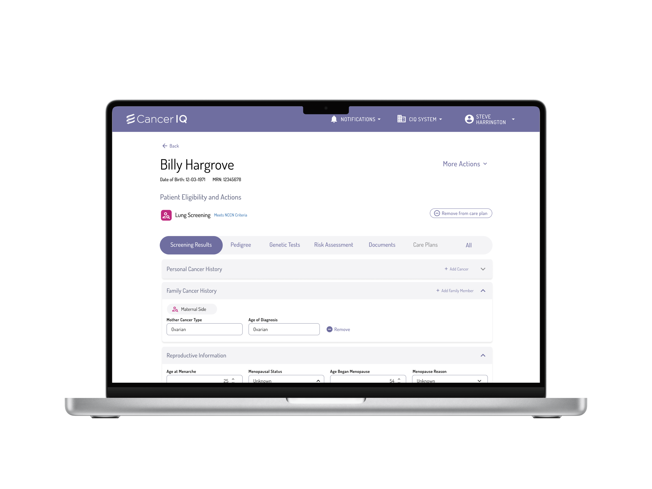
We iterated and applied these design changes to other areas of our application, as well. Here are a few visuals of the impact from the new design and UI changes.
Original UI
Updated UI based on Preventive Care needs
Updated UI based on Design System
This is a brief intro to the work I did on this project, which I completed alongside other objectives, including, but not limited to: conversations in sales calls, product enhancements to Navigator and Specialists, 3-part research initiative, and feedback capture at multiple sites. Happy to discuss my work at CancerIQ further with you.